Warm Luxury, Built to Last
Premium quality you can feel, designed to outlast trends. The system holds together across billboards, brochures and uniforms so every touchpoint reads as part of the same home.
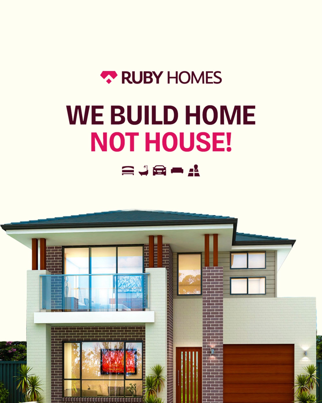
We build home, not house.
Ruby Homes was evolving. The rebrand's job was to position the company as a modern, premium and human-centred home builder — a brand that blends architectural strength with warmth and trust, and turns property selling into an emotional connection. Everything hangs on one line: we build home, not house.

The icon is built from the geometry of a ruby gemstone — a shape known for durability, rarity and value. Inside the gem's facets, a roof emerges — a quiet argument that emotional warmth and structural strength belong to the same home. RUBY carries the weight; HOMES stays light beside it.
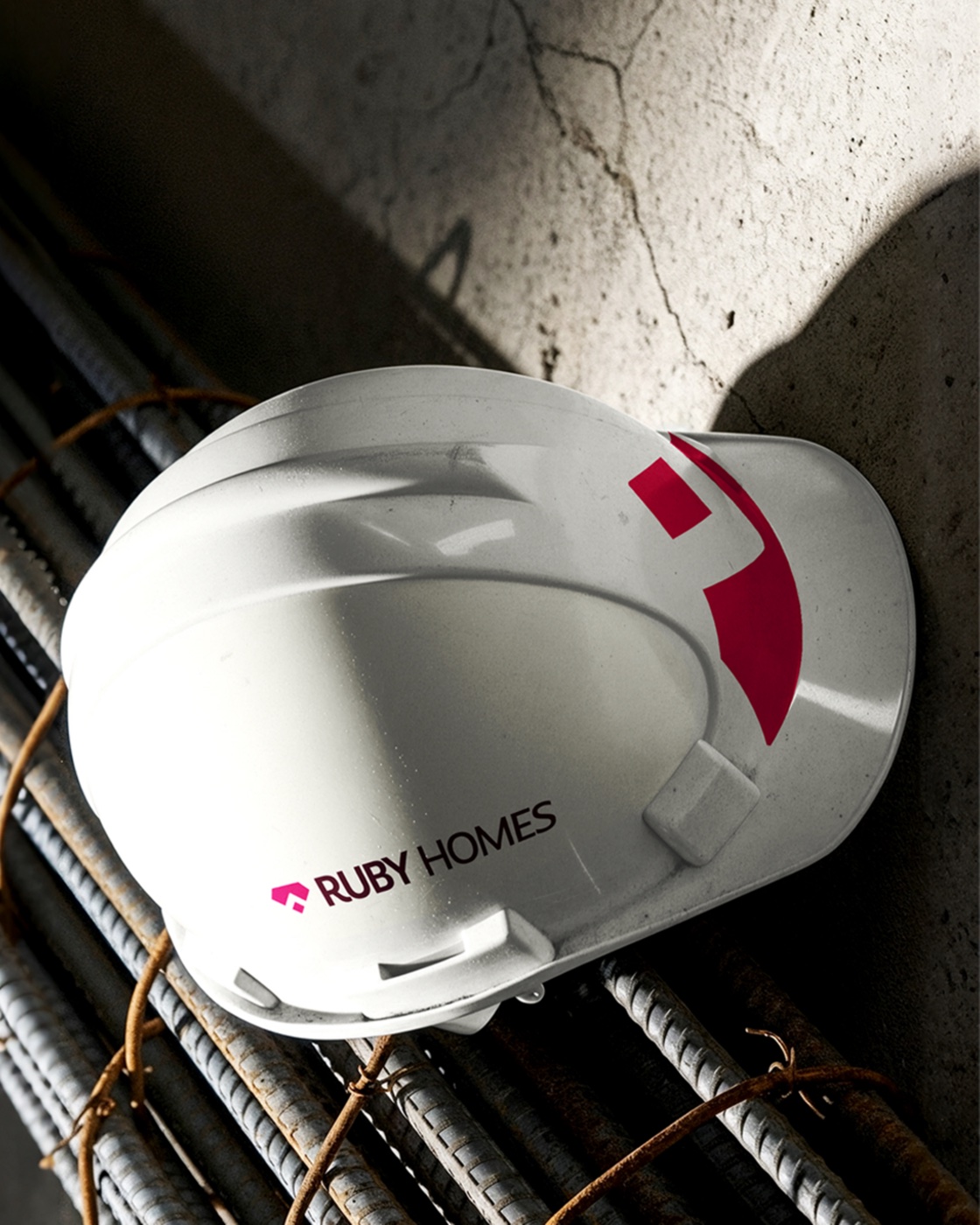
One identity, carried from a launch post to a highway billboard, a property brochure and a hard hat — consistent wherever it lands.
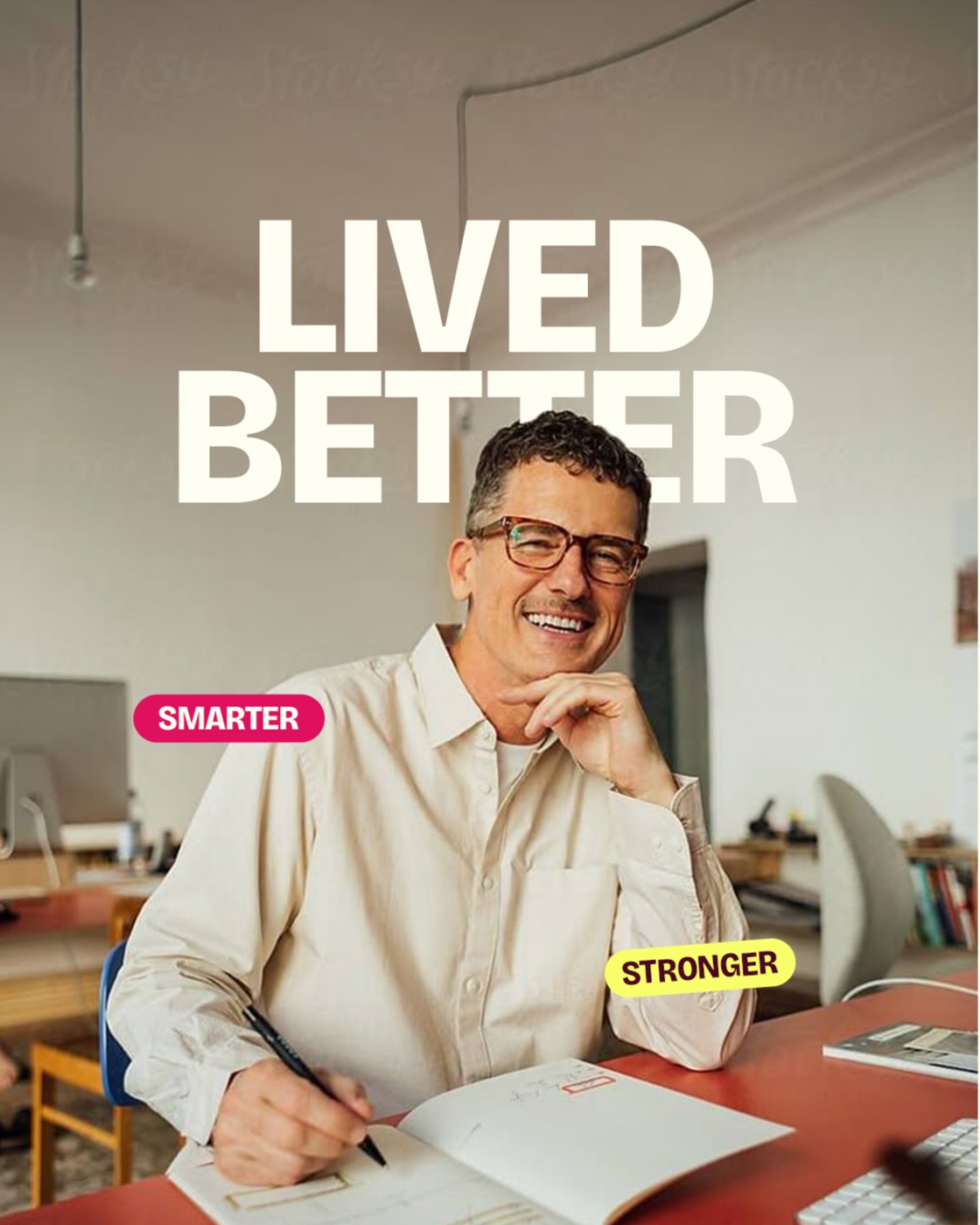
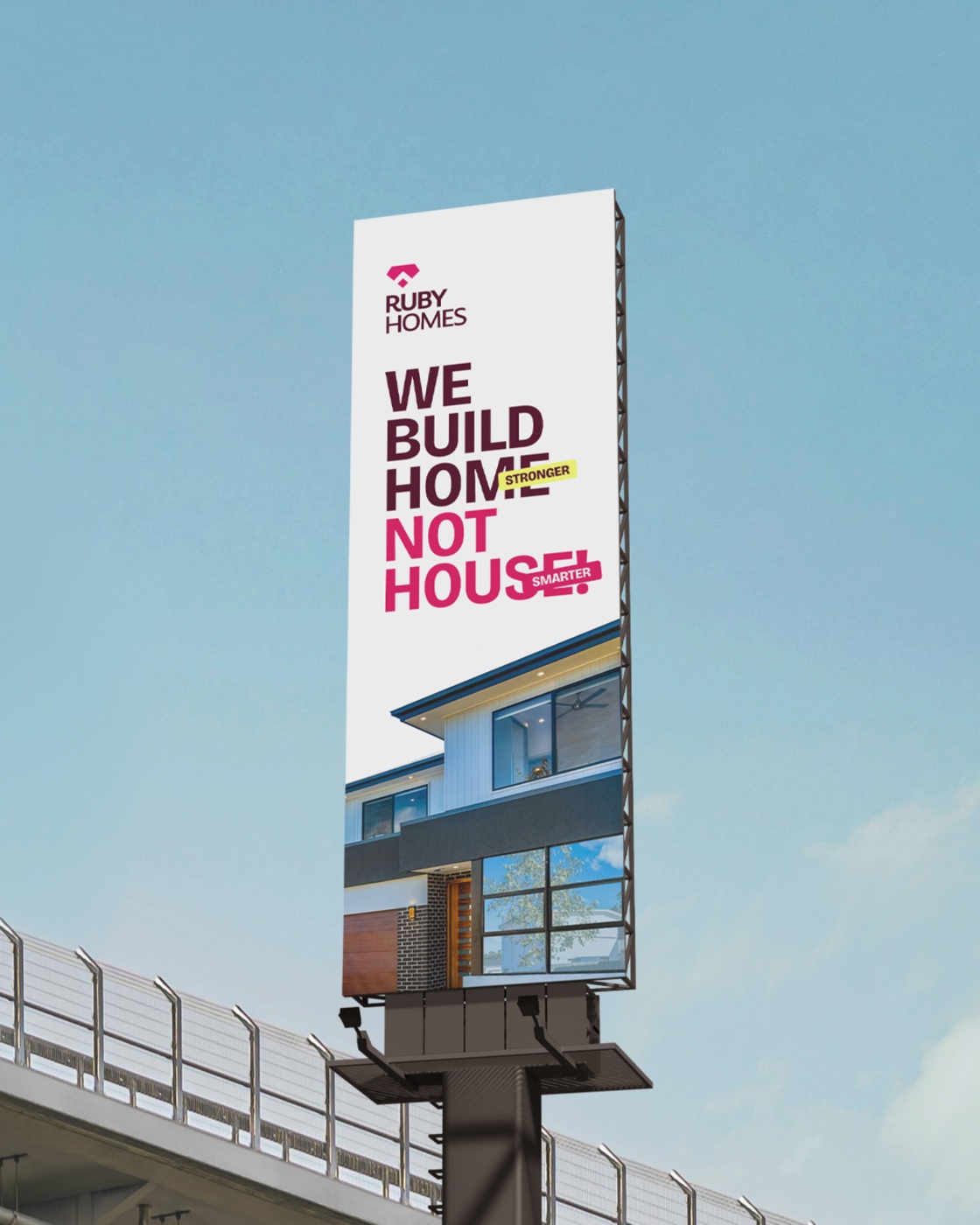
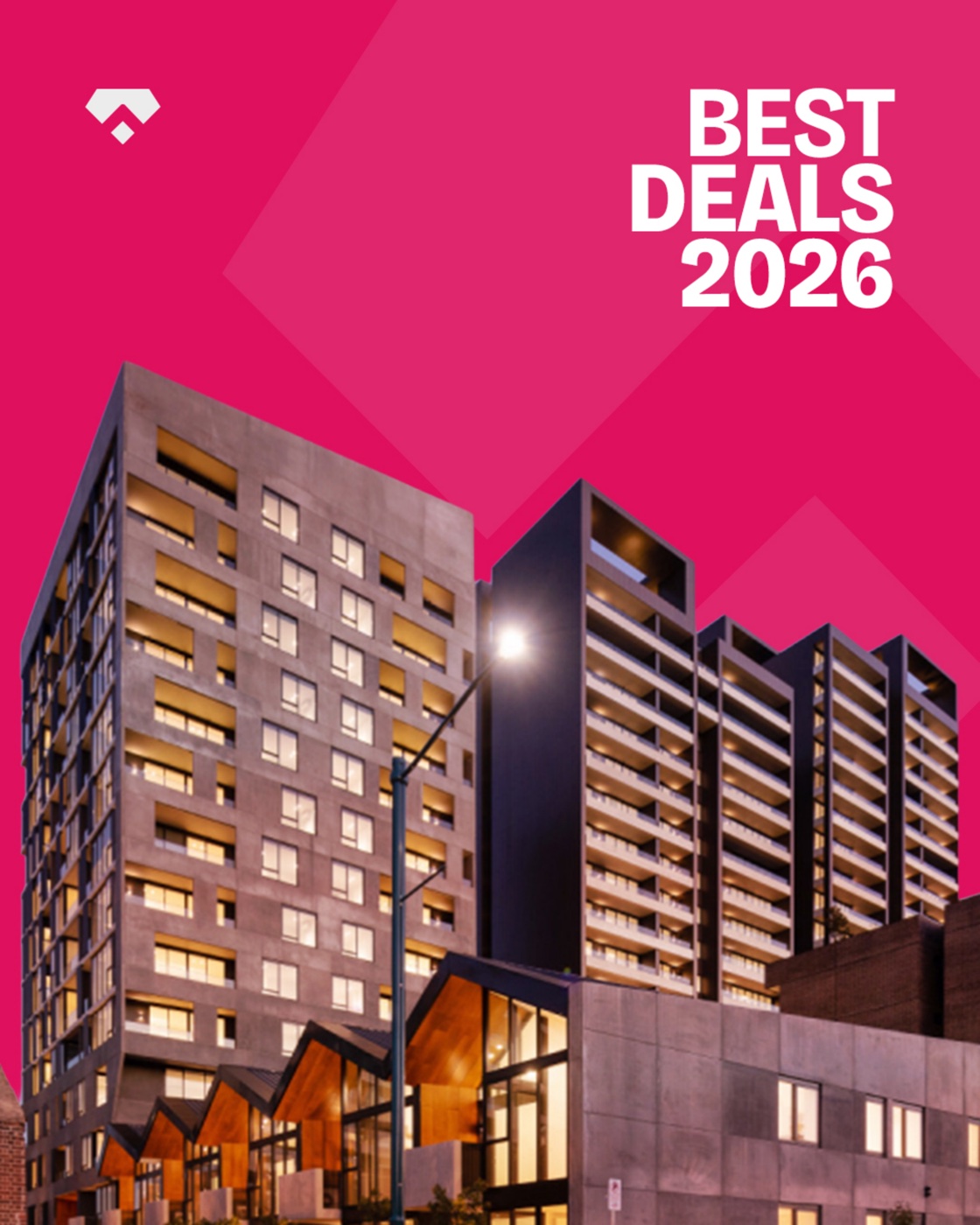
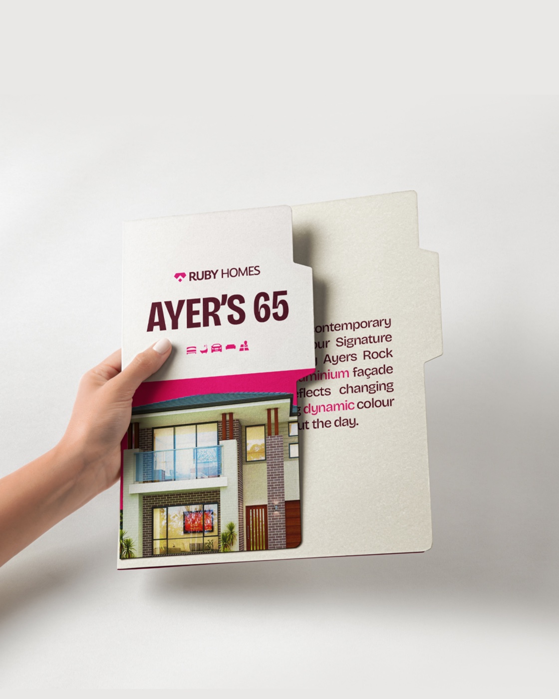
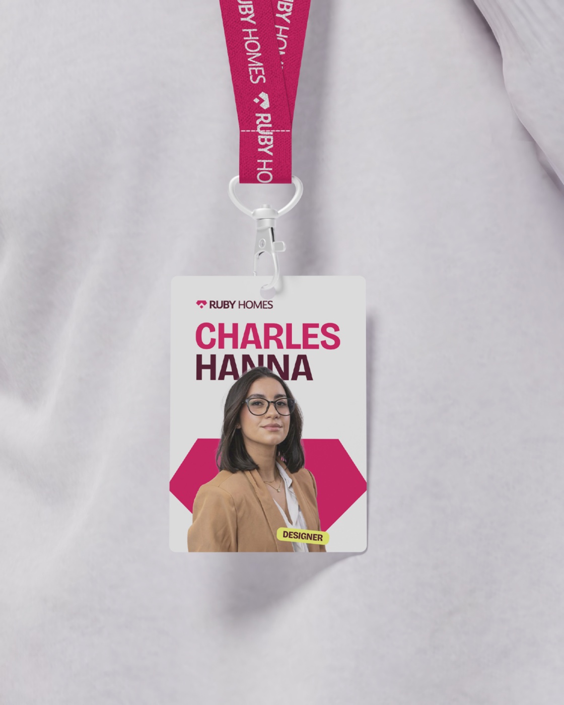
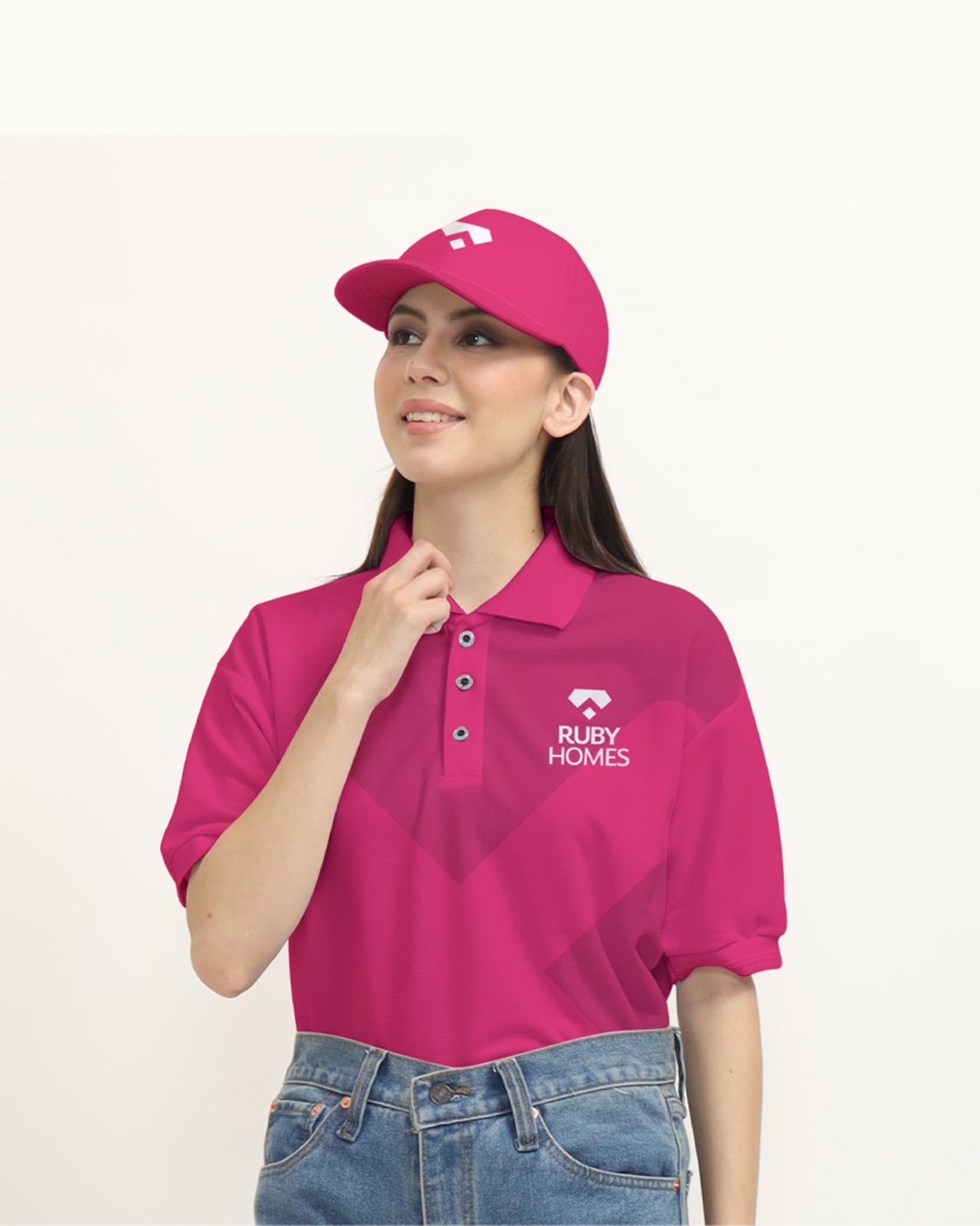
Lived better. Smarter. Stronger. — the Ruby Homes promise, from the badge on a hard hat to the billboard on the highway.
Premium quality you can feel, designed to outlast trends. The system holds together across billboards, brochures and uniforms so every touchpoint reads as part of the same home.
Strong without shouting. Type sits weighted but un-bold; the magenta arrives as punctuation — a single accent on a hard hat, a badge, a headline — never wallpaper.
High-end living that still feels lived-in. Photography centres people in the space — the promise of a home built for real life, sold as an emotional connection, not a spec sheet.
"Calm & reassuring. Strong but not aggressive. Detail-focused. Trustworthy. Human & warm. Confident without being loud." — Ruby Homes brand personality, from the brand book